garmin
23% Increase in CVR
17% Increase in LTV
12% Increase in AOV
Key changes:
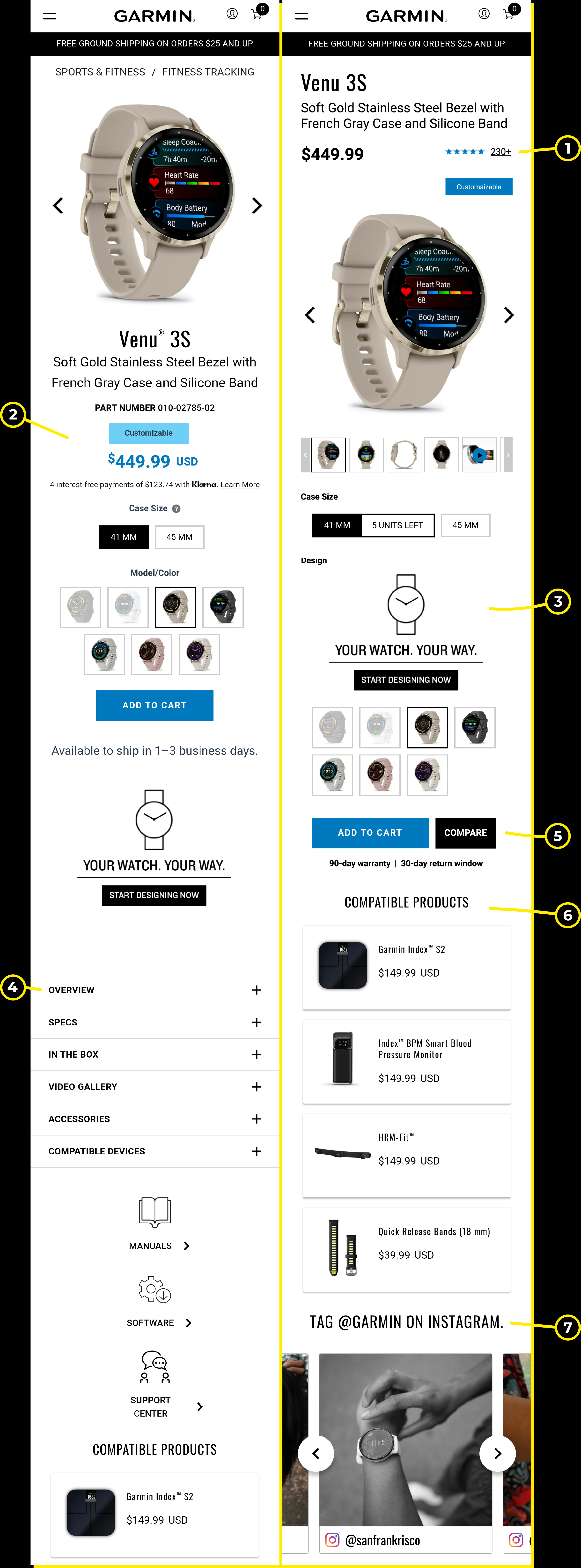
01/ For $$$ products, it’s extra important to put as many guarantees as you can around the price tag. If you were about to spend $450 on a smartwatch—wouldn’t you feel more confident if you saw that 200+ people are happy with their purchase.
02/ The horizontally centered design looks like a Jenga tower that’s about to fall. A well-designed PDP should make the best use of space, offering a balanced, visually appealing experience.
03/ The customization option is amazing… but it’s used so poorly in this instance. I’d add some super cool, extra limited, available one-time-only editions that cost extra + the option to select multiple strap designs.
04/ Too much info! The overview tab alone has 49 features listed and the specs tab has 100+. Pick around 10 to display with pictures and icons and use a video to go into more detail. You can leave the rest hidden in the specs tab.
05/ There’s no scarcity, urgency, bonuses, bundles, or guarantees. Nothing to make the customer buy now or spend more. Why?
06/ Bundles (with compatible devices), product comparisons, special parts, partnerships—there’s so much potential to drive higher sales and improve customer experience.
07/ The “Tag the Brand” section is an awesome way to encourage customers to share photos, videos, and reviews. This not only boosts engagement but also increases Garmin’s reach on social media.
Competing with the likes of Apple and Samsung in the smartwatch space doesn’t just happen… so, it’s safe to assume that Garmin’s products can hold their own.
But no matter how great your product is, you shouldn’t neglect the basics of e-commerce strategy!
Not unless you want to leave serious money on the table.